160
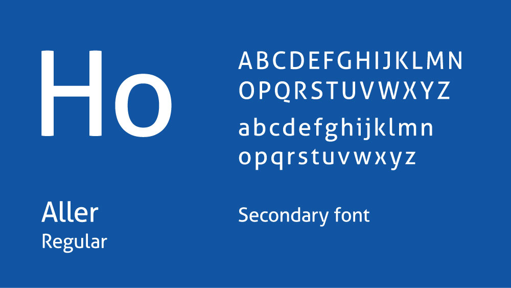
Rebranding & corporate identity for long-established Reigate building society
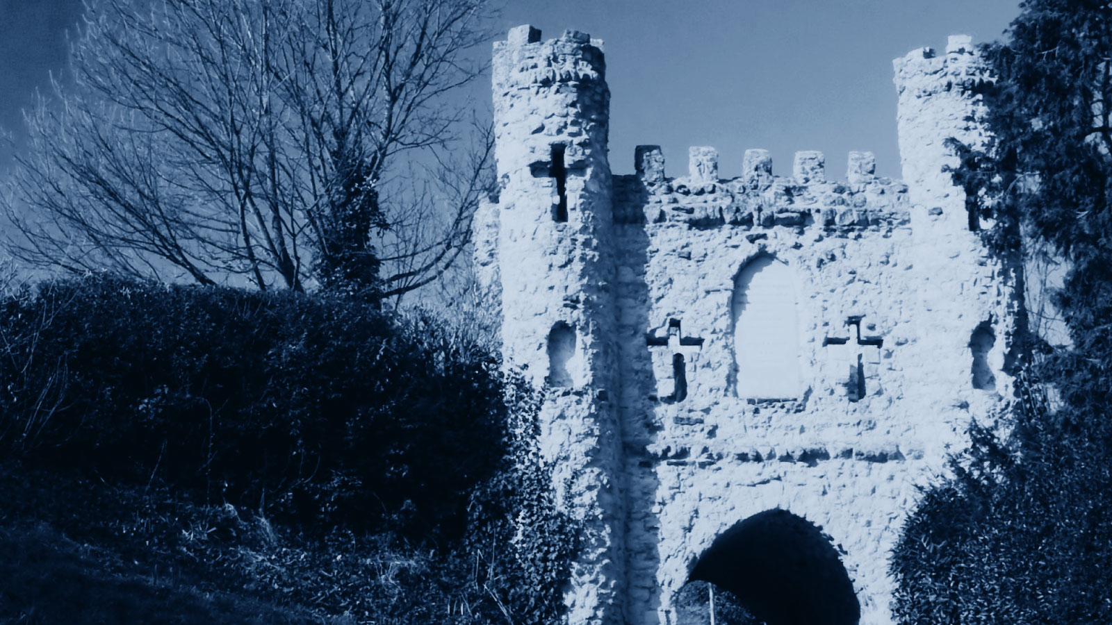
With over 160 years of heritage behind it, the rebrand of Reigate's oldest Building Society required empathy and attentiveness to all stakeholder views. After an initial brand strategy meeting, we built on the old brand's core elements, developing them into a more considered solution, uniting the letter H with Reigate's Castle, which in turn casts the shadow of a home. This concept evolved through all advertising, posters and marketing materials to strengthen the brand and build awareness.
years of heritage
15
logo concepts
5
brand styling options